
This article showcases 18 unique maps of America. Each map offers a unique perspective on the United States, highlighting different aspects of the country, such as population density, preferred slang words, weather patterns, and more. Whether you’re a history buff, a geography enthusiast, or just curious about the country, these maps are sure to offer something fun and interesting. So, without further ado, let’s dive into the maps!
Read: Why Americans Refrigerate Their Milk Even Though Much of the World Doesn’t
1. Maps showing railways no longer in use
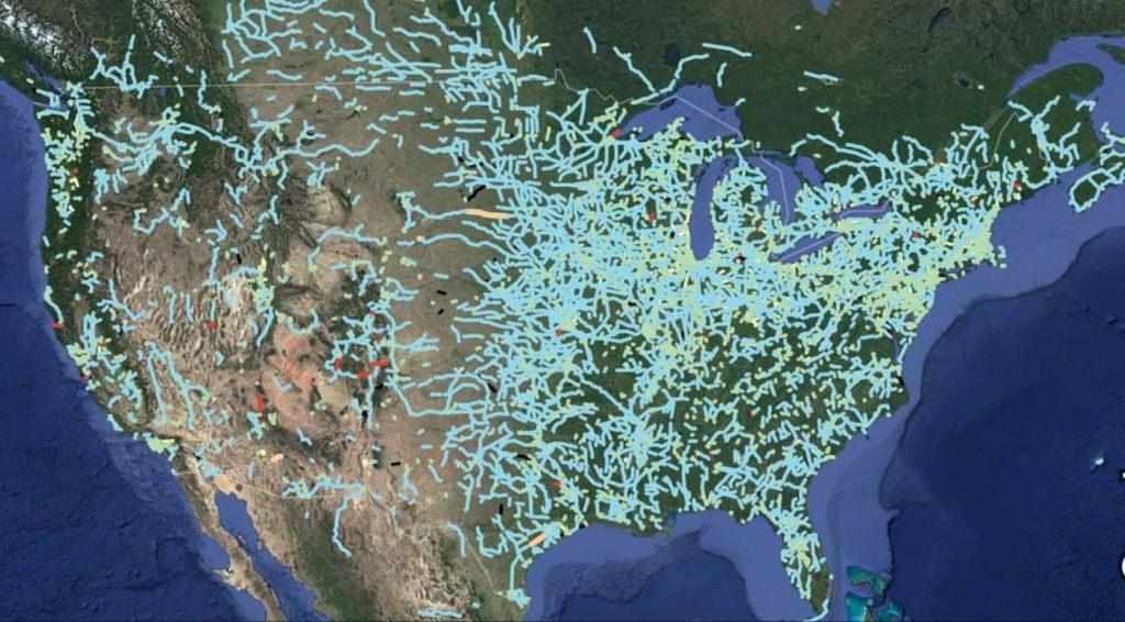
Modern day has brought forth bigger and much faster trains. The old railways are no longer useful because the trains are incompatible, so they are just sitting there, not being used. This maps out all the forgotten railways.
2. Maps of illusions
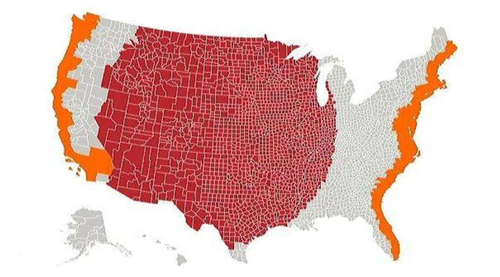
This map maps out the population of the various areas of America. The orange area on either side of the map is long and narrow. But the seemingly much larger red portion happens to have the same population. This is slightly deceiving, but there it is.
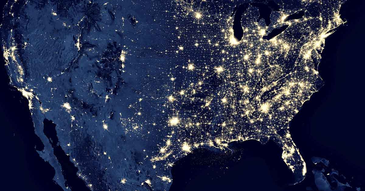
3. Maps of light pollution
In this map, we can see how light pollution is pretty severe along the coasts. However, the entire right-hand half of America is riddled with light pollution, particularly on the coast. However, the left-hand side, particularly inland, is not as polluted with light.
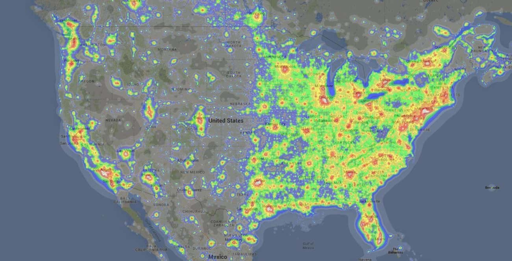
4. High GDP maps
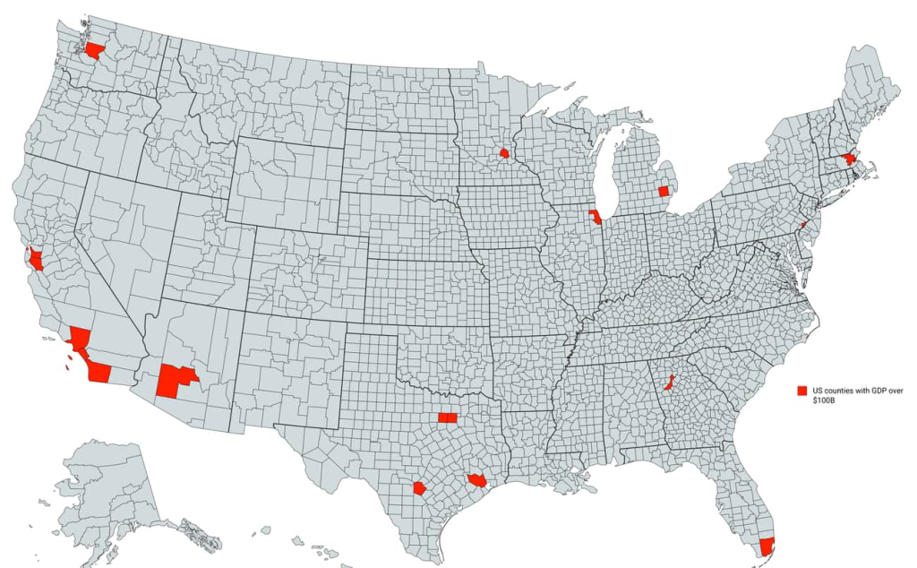
In this map, we can see the different areas that have a high GDP. Specifically a GDP over $100 billion. If you don’t know what a GDP is, it “measures the monetary value of final goods and services—that is, those that are bought by the final user,” according to IMF.com.
Read: Oldest Mall In America Turned Into Tiny Homes
5. Maps of population density
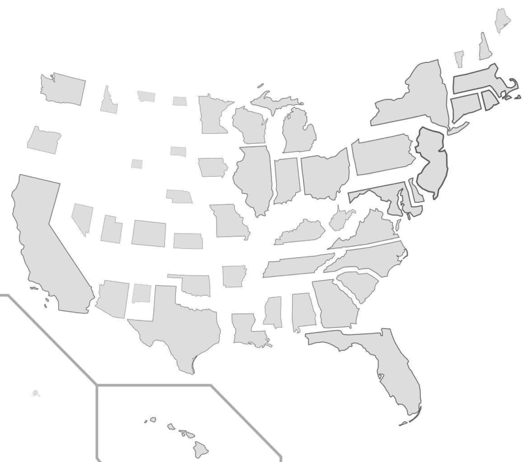
This is an interesting take on population density. Although, this map has been altered slightly. In other words, each state has been resized appropriately according to the density of the population.
6. Most spoken work maps
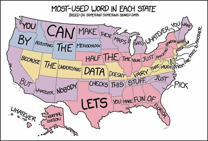
In this map, we can see what word is favored above all in each state. Slang is contagious, but each state has its own language of slang words, and we all tend to use certain words more than others. But something tells us that this map might be a little more tongue-in-cheek than fact (take a look at the states above Florida).
7. Regional weather maps
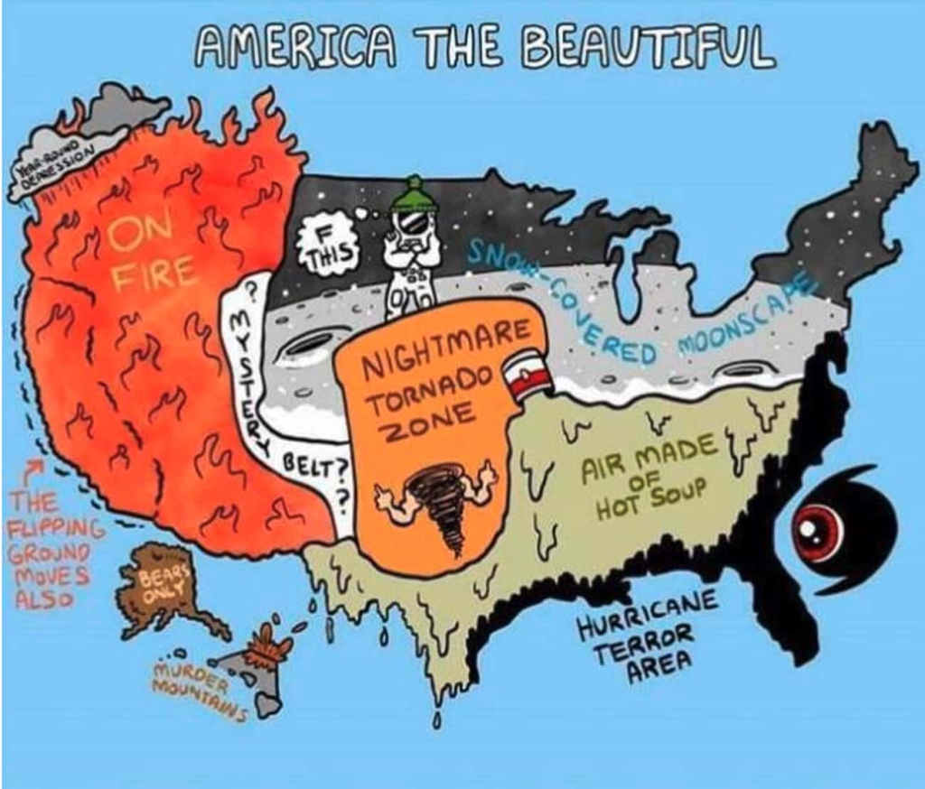
This funny map shows how each region fares in terms of weather. As you can see, a large portion of America is rather hot, and other are freezing cold. Beware of the area that says “bears only.“
8. Who says “dang?“
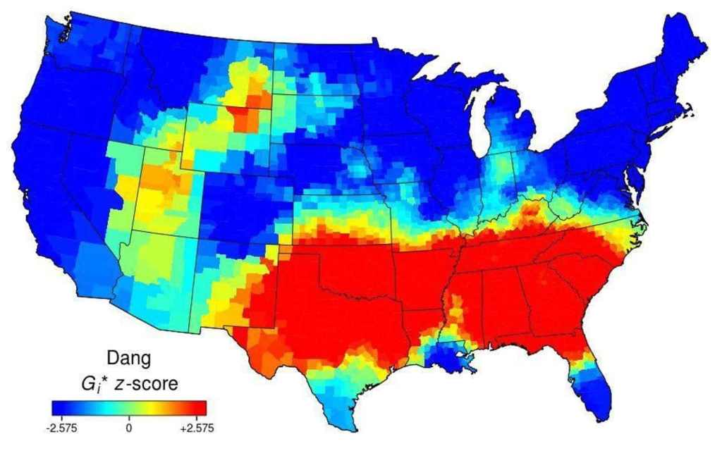
In the movies, Americans seem to love saying “dang.” However, as slang would have it, only certain areas actually use it as often as the rest of the world thinks. This image maps out the areas of the US where people love using the word, “dang.”
9. Colombus day?
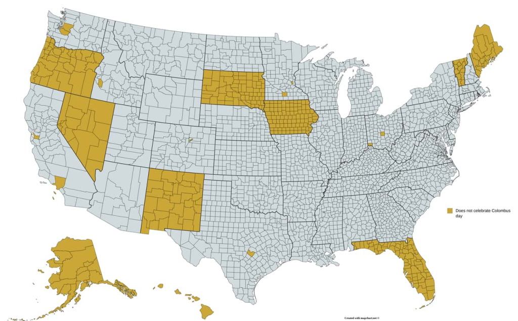
For the non-Americans, Colombus day is a National celebration commemorating the day Christopher Colombus arrived on the shore of the Americas. Not every state celebrates it officially, though.
10. Maps showing comparative populations of Los Angeles and other states
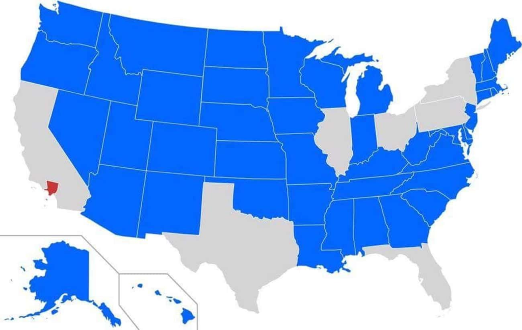
This map truly puts into perspective how many people live in Los Angeles. Everyone knows it has a massive population, but this is something else. Every state highlighted in blue has a smaller population than Los Angeles.
11. The red maps out a higher population than the grey
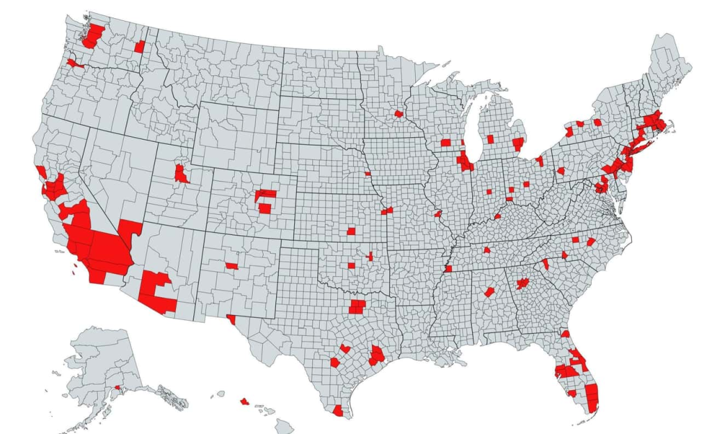
If you were to add up the populations of each county that is highlighted in red, you would find there are more people living there than in the entirety of the grey counties.
12. Maps of trees
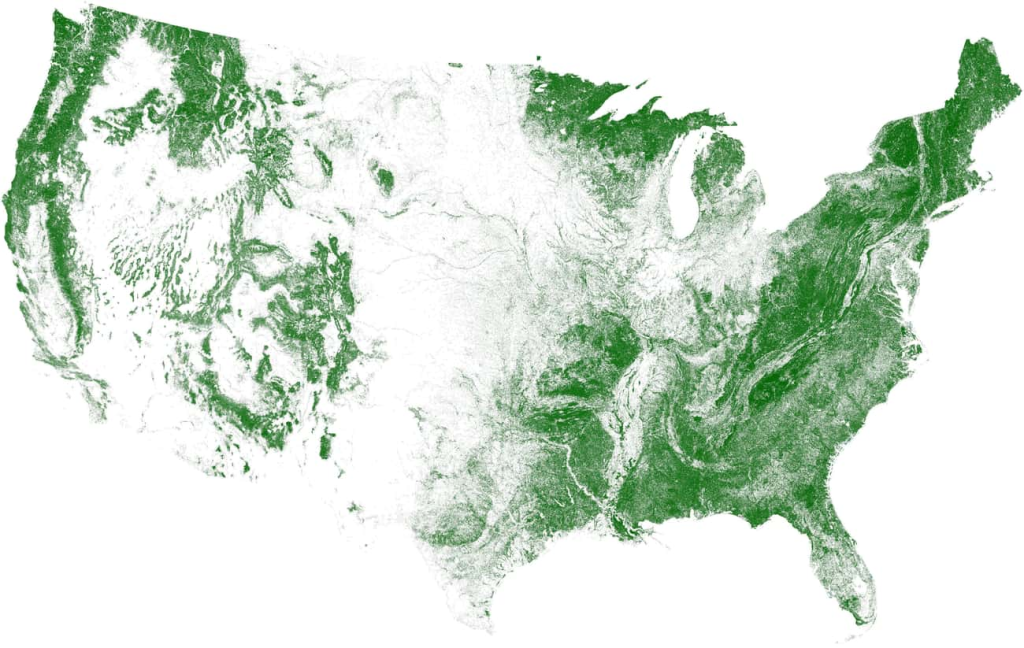
Although you would be wrong, this map could almost pass for a weather circuit. This map actually depicts tree cover in the United States.
Read: Bill Gates Attempts to Explain Why He Bought More Farmland Than Anyone Else in America
13. This maps out the loud zones and quiet zones
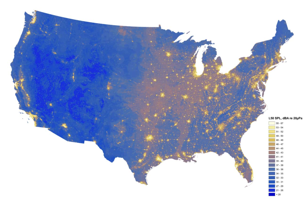
Some people prefer the quiet life emersed in nature. This means no loud music or festivals. Other states are known for their nightlife and ability to make some noise. You can see exactly where the loud and quiet zones are on this map. Wyoming is looking pretty peaceful, but New York, not so much.
14. Maps of increases in population
This map invites you to see things from a different perspective. Here it shows you population spikes in different areas around the country.
15. Maps of the many Springfields
The Simpsons sure put the town called Springfield on the map, but which one exactly? In the US, there are 41 towns called Springfield. They span 35 different states.
16. Maps of the many roads
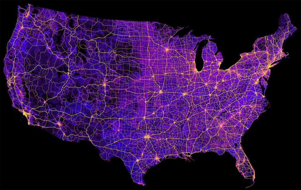
The United States is known for its modern roads with minimal bumps or potholes. There are, of course, rural roads as well. But, as you can see in this map, thousands of roads and highways exist.
17. Maps of Air traffic control zones
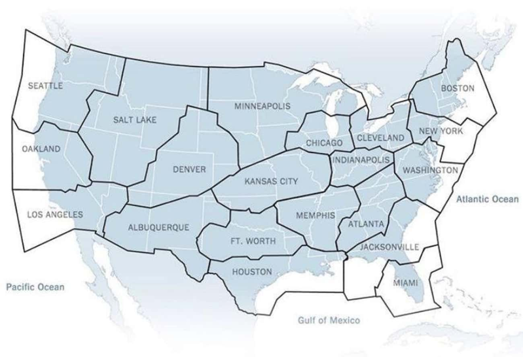
If you have a drone, you might be familiar with the air traffic control zones. If not, enjoy this one. It shows you exactly where each zone starts and ends.
18. Preferred coffee shops
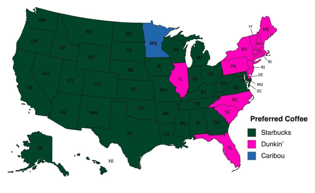
Coffee is not a joke in America. Every citizen takes their cuppa joe very seriously (don’t worry, we know Australians do too). Furthermore, each state seems each state has a preferred brand of coffee.
Keep Reading: 14 Facts We Can’t Believe No One Told Us Before Now
Sources
- “18 Maps Of The United States That Made Us Say ‘Whoa’.” Ranker. Tucker Desaulenier. June 23, 2021.
- “30 Interesting Maps That Might Change Your Perspective, As Shared On This Instagram Account.” Bored Panda. Rokas Laurinavičius and Austėja Akavickaitė. 2022