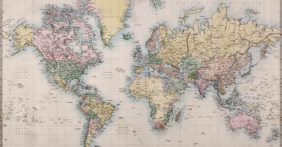

Growing up in school, at some point you likely learned global geography using a world map. Perhaps you even had a big world map on the wall in your classroom. While the map you used is useful for many things, one thing it is not is accurate about the actual sizes of each country in comparison to the rest. That’s right: While some countries are depicted as much larger than they are, such as the United States and Greenland, others are shown as much smaller.
World Map Is Not Accurate About The Sizes of Countries
When you look at the world map, you would assume that Russia is massive, Greenland is pretty large, and that the United States and Canada also take up much more land than other countries such as Brazil, or even entire continents like Africa. More recent interactive maps, however, show that this isn’t necessarily the case. For example, the map you likely have seen most often depicts Greenland as roughly the same size as the entire continent of Africa. In reality, it is about one-fourteenth of it. Russia and Canada, though they are still large countries, aren’t actually quite the size that we’ve seen them on the classic world maps. Brazil is another country that is far larger than it typically appears. (1)
Why Is The Classic World Map So Inaccurate?
The world map that most of us are familiar with is called the Mercator Projection. Cartographer Gerardus Mercator created it in 1569. Essentially, he took the globe and created a cylindrical map projection. He placed the global in a cylinder and then projected each point of the map onto the corresponding points on the cylinder. (2)
From there, he mapped Meridians (imaginary vertical lines going through the Earth from the North to South pole) onto vertical lines equally spaced apart on the map, and circles of latitude (imaginary horizontal lines from East to West) onto equally spaced horizontal lines. He did it this way because the purpose of the map was navigation for ships making voyages across the different seas and oceans.
The Mercator Projection allows for ships to course-correct for the curvature of the Earth less often. Unfortunately, it distorts the size and shape of the land masses. Countries around the equator are more or less correct, however, the further you go from the equator, the more inflated and distorted the subsequent countries become.
Read: There’s a circular island that floats and rotates but nobody’s exactly sure how
How To See The Actual Sizes of Countries
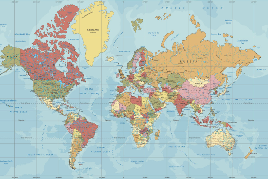
If you are a sea-faring person and aren’t attempting to navigate a ship across the Atlantic, then you are probably more interested in a map that accurately represents the size and shape of the countries of the planet. Thankfully, there are interactive maps that allow you to drag and drop countries on top of others in order to see their actual sizes in comparison to how they are usually depicted on a map. The website The True Size Of is easy to use and truly eye-opening.
The map that this website uses is based on a different projection, called the Gall-Peters Projection. This is a rectangular map projection that is less concerned with naval navigation and more so with the real sizes and shapes of the countries of our world.
More Fun Interactive Maps
Remember when you were a kid and people used to make jokes about digging a hole straight through the Earth to get to China? If you dug a hole straight through the ground, through the center of the Earth, would you actually end up in China? The answer is, it depends. If you lived in places like, say Santiago de Chile or Buenos Aires, Argentina, then yes – you would! If you were digging from New York, however, you would end up in the Indian Ocean somewhere far off the coast of Perth, Australia. If you were to dig from Los Angeles, you’d end up off the coast of Madagascar. If you want to see for yourself where you might end up from wherever you live, you can play around with the map here.
Keep Reading: 50 Years Ago NASA Sent a Map Into Space to Help Aliens Find Earth—Now They’ve Got An Awesome Update
Sources
- “Interactive Map Shows You The Actual Size Of Your Country, Not The Lie You’ve Been Told By Maps.” IFL Science. James Felton. June 8, 2020
- “The world map you know and love? It’s been lying to you..” Vox. German Lopez. August 17, 2016.